Kraft packaging often looks simple, but printing on it is not simple at all. The wrong color, weak contrast, or poor artwork setup can make the box look dull, cheap, or hard to read.
Printing on kraft paper works best with high-contrast colors, simple layouts, bold typography, and graphics that respect the natural brown base. Dark inks usually perform best. White ink can create strong contrast. Light colors often look weaker unless opacity and print method are carefully controlled.
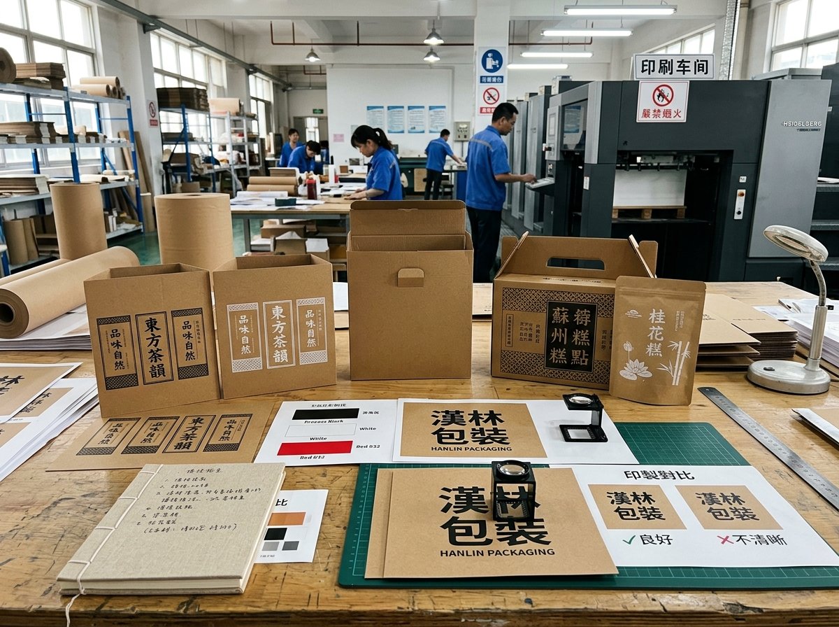
Kraft paper has become a popular choice in packaging because it supports a natural look, an eco-friendly brand image, and a more grounded visual style. Still, many packaging projects fail because the design is built as if kraft were white paper. That is where problems begin. Colors shift. Logos lose clarity. Fine details disappear. The box may still be usable, but the finished packaging does not support the brand the way it should. A better result starts with understanding how kraft paper changes both color and design behavior.
Why Is Printing on Kraft Paper Different from Printing on White Paper?
Many packaging designs are created on bright digital screens. Then they are printed on natural kraft board and look completely different. This gap is one of the biggest reasons kraft packaging disappoints buyers.
Printing on kraft paper is different because the brown base color affects every ink placed on top of it. Kraft is not a neutral background. It changes color appearance, reduces brightness, lowers contrast for some tones, and makes light or delicate graphics harder to reproduce clearly.
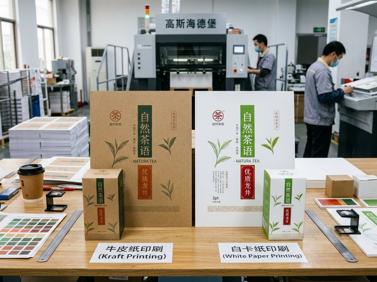
White paper gives colors a cleaner and brighter result because the surface underneath does not compete with the ink. Kraft paper does the opposite. It adds a warm brown tone under every printed element. That means bright yellow may look muddy, pastel pink may disappear, and light gray may feel weak. Even brand colors that look accurate in artwork files can shift once they are printed on a natural kraft surface.
This matters a lot in packaging because the box is often judged before the product is touched. If the print looks faded, weak, or unclear, the packaging starts to feel lower in quality. That is especially risky when the box is meant to support premium handmade goods, natural skincare, candles, food packaging, gift boxes, or retail products where visual trust matters. Kraft can look strong and premium, but only when the design is built for kraft from the beginning, not adapted at the last minute.
Best Ink Colors and Contrast Strategies for Printing on Kraft Paper?
Color choice is the first big decision in kraft packaging design. Some colors work naturally with the material. Others fight against it and lose.
The best ink colors for kraft paper are usually black, dark brown, deep green, dark blue, burgundy, and white. These colors create stronger contrast against the brown surface. White ink is especially useful when the design needs clean separation, stronger readability, or a more premium printed effect.
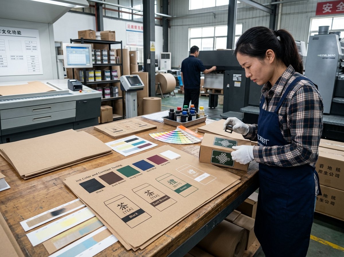
Dark inks usually perform well because they sit clearly on the kraft background. Black remains the safest option for text, logos, line art, and product details. Deep forest green and navy can also work well when the brand wants a softer alternative to black but still needs strong visibility. Burgundy often works in premium food, cosmetics, and gift packaging because it feels rich without fighting the kraft base.
White ink is one of the strongest tools in kraft packaging. It creates contrast that the natural board cannot provide on its own. A white logo, white product name, or white pattern can make the box look much cleaner and more intentional. In some cases, white can also be used as a base layer under another color, though that depends on print method and budget.
Light colors are more difficult. Soft pink, pale blue, mint, lavender, and light gray often lose strength on kraft unless the design is very simple and the print coverage is handled carefully. This is why strong contrast strategy matters. Dark text over kraft is safer. White over kraft is cleaner. Large blocks of weak color are often disappointing. A kraft design should use the board color as part of the palette, not as a problem to hide.
How to Design Packaging Graphics That Work Well on Natural Kraft Surfaces?
Kraft paper rewards design discipline. Clean artwork often looks better than crowded artwork. Simple graphics usually print better than delicate ones.
Packaging graphics work best on kraft surfaces when they are bold, uncluttered, and built around the natural paper tone. Thick lines, strong shapes, simple icons, clear spacing, and easy-to-read typography usually create a better result than highly detailed artwork or low-contrast decorative elements.
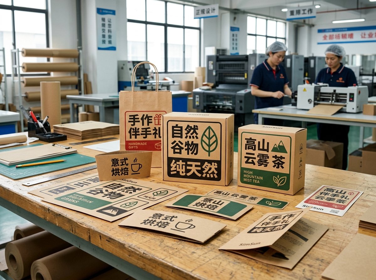
A good kraft packaging design usually begins by accepting that the paper itself is part of the artwork. The brown surface already adds visual texture and warmth. That means the printed design does not need to do everything. In fact, trying to fill every space often makes the packaging look noisy. A cleaner layout usually feels more premium.
Typography should be clear and sturdy. Very thin serif fonts, small reversed text, and delicate script styles can lose definition on kraft. Sans serif fonts, medium-weight serif fonts, and simple bold logos usually hold better. The same rule applies to line art. Thick lines and solid shapes print more consistently than fine detail. If the packaging includes patterns, they should be open enough to breathe against the kraft background.
The strongest kraft packaging often uses fewer colors, more space, and a more direct layout. That is why kraft works so well for natural food products, handmade items, eco-conscious skincare, candles, soap boxes, coffee packaging, and gift packaging with a warm, honest visual tone. The design does not need to overpower the material. It needs to work with it.
Common Printing Challenges on Kraft Paper and How to Avoid Them?
Many kraft printing problems are predictable. They happen again and again because the artwork was not prepared for the material, or because the packaging goal was not clear enough at the start.
The most common printing challenges on kraft paper are weak color visibility, poor contrast, muddy light tones, loss of fine detail, inconsistent brand color appearance, and designs that look too busy on a textured natural background. These issues can be avoided with better color planning, stronger artwork structure, and realistic print expectations.
One frequent problem is low contrast. A brand chooses a light color because it looks soft and elegant on screen. On kraft, that same color becomes flat and hard to notice. Another problem is over-detailing. Thin lines, tiny icons, and dense decorative patterns may look sharp in digital proofs but print poorly on natural kraft board, especially if the board has visible fiber texture.
Brand color mismatch is also common. A company may have a strict color standard, but kraft naturally shifts the result. If exact color control is critical, the packaging may need white ink support, a printed label approach, or even a different board choice. In some projects, kraft may not be the best fit if brand color consistency matters more than natural appearance.
Another challenge is expecting kraft packaging to look “luxury” through graphics alone while using weak print contrast or poor layout. The result can feel cheap instead of premium. A better approach is to build premium feel through composition, material thickness, clean finishing, controlled color use, and precise printing rather than through too many graphic elements.
How Can Brands Balance Natural Kraft Style with Clear Product Communication?
A kraft box may look attractive, but packaging still has a practical job to do. It must communicate what the product is, what the customer should notice first, and what information needs to be easy to read.
The best kraft packaging balances natural style with functional clarity. Brand marks, product names, key selling points, and required information should stay highly readable, while decorative graphics should support the natural board instead of competing with it.
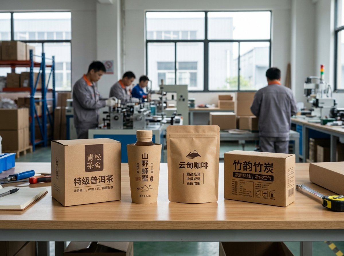
This matters because some kraft packaging becomes too minimal, while some becomes too decorative. If the design is too quiet, important product information disappears. If it is too busy, the natural strength of kraft is wasted. The better middle ground is clear hierarchy. The logo should stand out. The product name should read quickly. Supporting information should be well organized. Decorative elements should help frame the design, not bury it.
This is especially important for retail packaging where quick shelf recognition matters. It also matters for e-commerce packaging, where the first physical impression shapes trust. If a customer opens a kraft box and sees strong, neat, readable printing, the package feels considered. If the print looks faded or messy, the natural material can start to feel like a cost-cutting choice instead of a design choice.
What Should Buyers Confirm with Suppliers Before Printing on Kraft Paper?
Good kraft printing begins before production. Many problems can be avoided if the packaging supplier and buyer confirm the right details early.
Before printing on kraft paper, buyers should confirm the board shade, surface texture, print method, ink opacity, white ink availability, line thickness limits, color expectations, and whether samples are produced on the actual kraft material instead of a digital mockup.
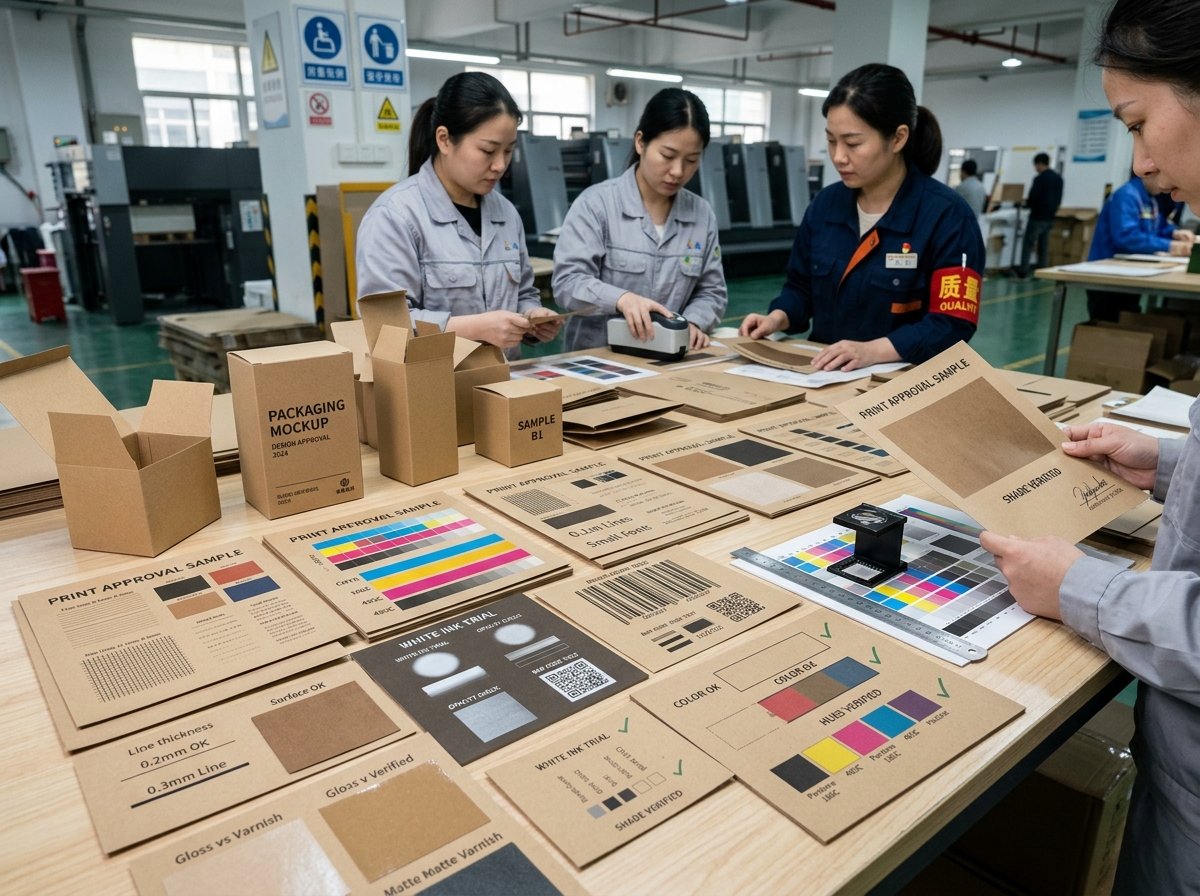
Material shade matters because not all kraft is the same brown. Some boards are lighter. Some are darker. Some have more visible fiber texture. That directly affects print appearance. Buyers should also confirm whether the design will be printed by offset, flexo, or screen printing, because each method handles detail and opacity differently.
It is also important to review the artwork for practical print limits. Very thin lines, small text, and low-contrast colors should be flagged before sampling. If white ink is needed, that should be agreed early because it affects both cost and final look. Most important of all, samples should be made on the real kraft board. A screen proof is not enough. Kraft changes the result too much for that.
Strong suppliers help make this process easier by giving design guidance early, not only printing whatever file arrives. That kind of factory support is often what separates kraft packaging that looks intentional from kraft packaging that looks uncertain.
Why Does Good Kraft Printing Often Look Simpler Than Buyers Expect?
Some of the best kraft packaging is not the most complex. It is the most controlled. It uses the material well and avoids trying to force too much onto the surface.
Good kraft printing often looks simpler because kraft already provides texture, warmth, and character. Simple designs with strong contrast, fewer colors, and cleaner spacing usually look more premium and print more reliably than complex designs with many soft colors or fine details.
This is one reason kraft works so well in modern packaging. It supports a visual style that feels direct, honest, and grounded. But that style only works when the design is disciplined. If every part of the packaging is treated like a white coated board, the result often feels heavy and unresolved. When the artwork is simplified, the kraft itself becomes part of the brand expression.
That is also a smarter commercial approach. Simpler kraft printing can reduce print risk, improve consistency, and create a cleaner customer impression. It often helps the box feel more natural and more confident at the same time.
Conclusion
Printing on kraft paper works best when the material is treated as part of the design, not as a background to fight against. Strong contrast, dark inks, white highlights, simple graphics, and clear layout usually deliver the best result. Light colors, weak hierarchy, and over-detailed artwork often create avoidable problems.
That is why good kraft packaging starts with the right design logic. The board color should support the brand. The print colors should stay readable. The graphics should respect the natural surface. When these parts are aligned, kraft packaging can look clean, premium, and commercially strong without losing its natural appeal.