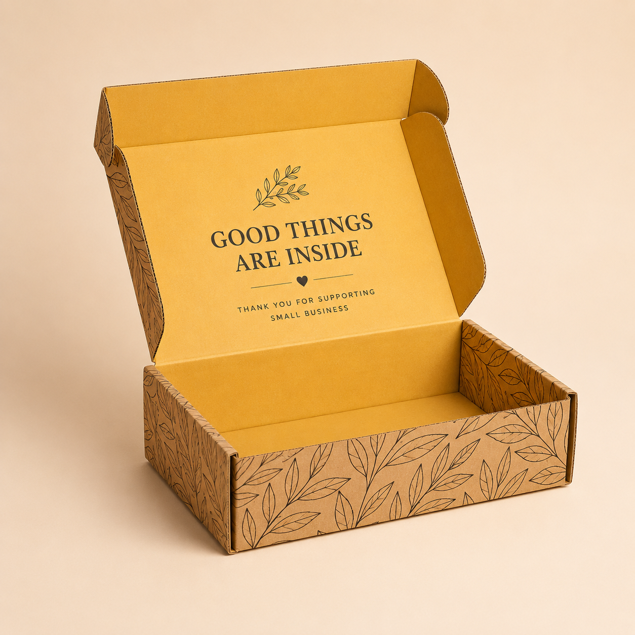
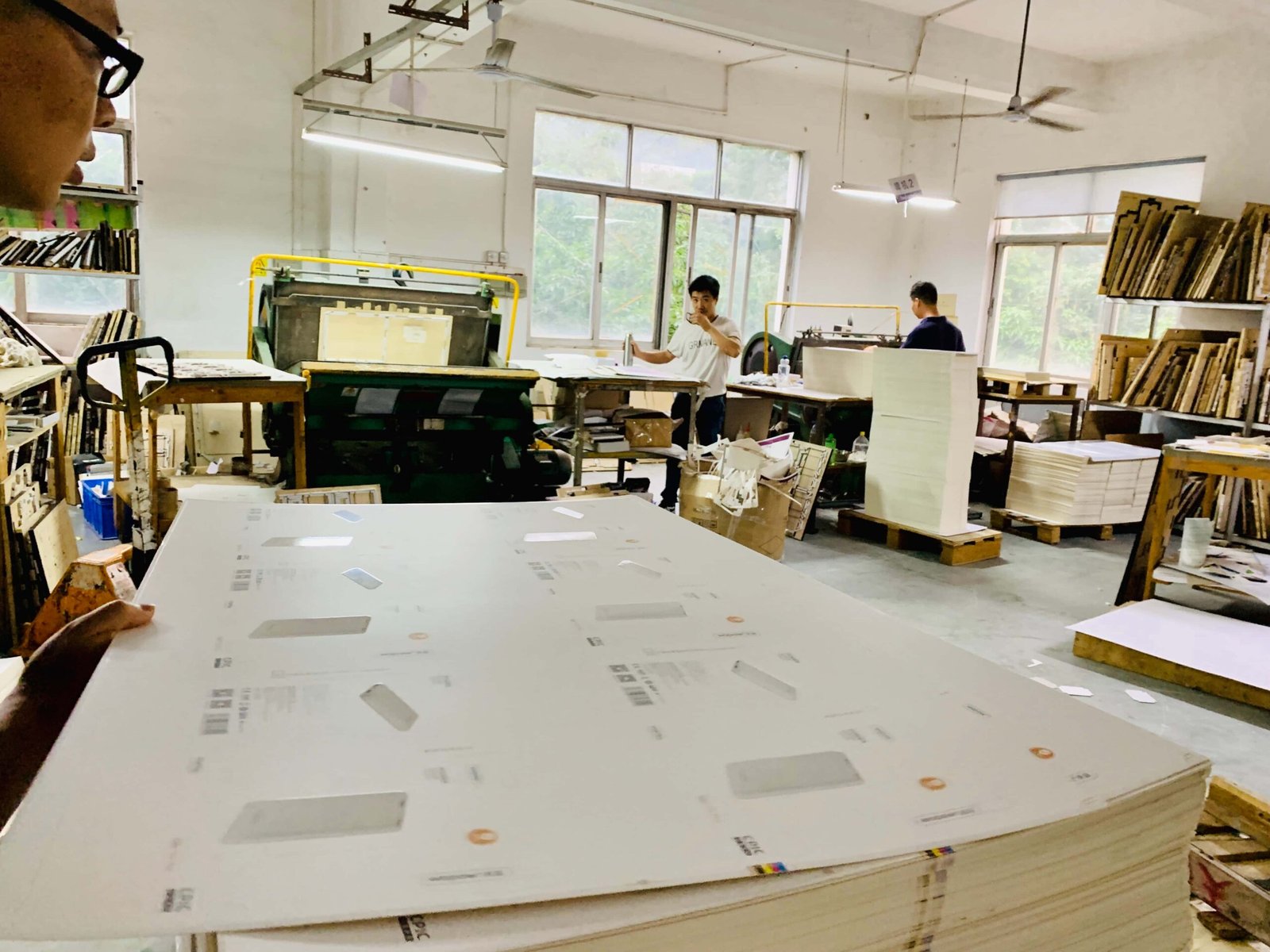
Kraft and white mailer boxes may use a similar structure, but they create very different impressions. Kraft packaging tends to feel natural, minimal, and practical, while white mailer boxes provide a cleaner surface for bright colors, detailed graphics, and polished branding.
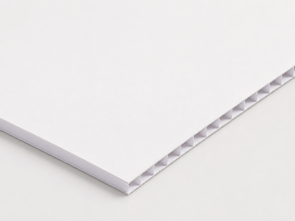
The right choice depends on more than appearance. Material finish, print quality, brand style, sustainability goals, product type, and budget can all influence which option works better. A kraft box may suit an eco-conscious or handmade brand, while a white mailer can be a stronger fit for cosmetics, fashion, gifts, or products that rely heavily on visual presentation.
In this guide, we will compare kraft and white custom mailer boxes in terms of look, printing, cost, durability, and common uses. By understanding the differences, you can choose the material that fits your brand identity and packaging requirements more effectively.
How Kraft and White Mailer Boxes Shape Brand Perception
Kraft and white mailer boxes can use the same basic structure, but the visual impression they create is very different.
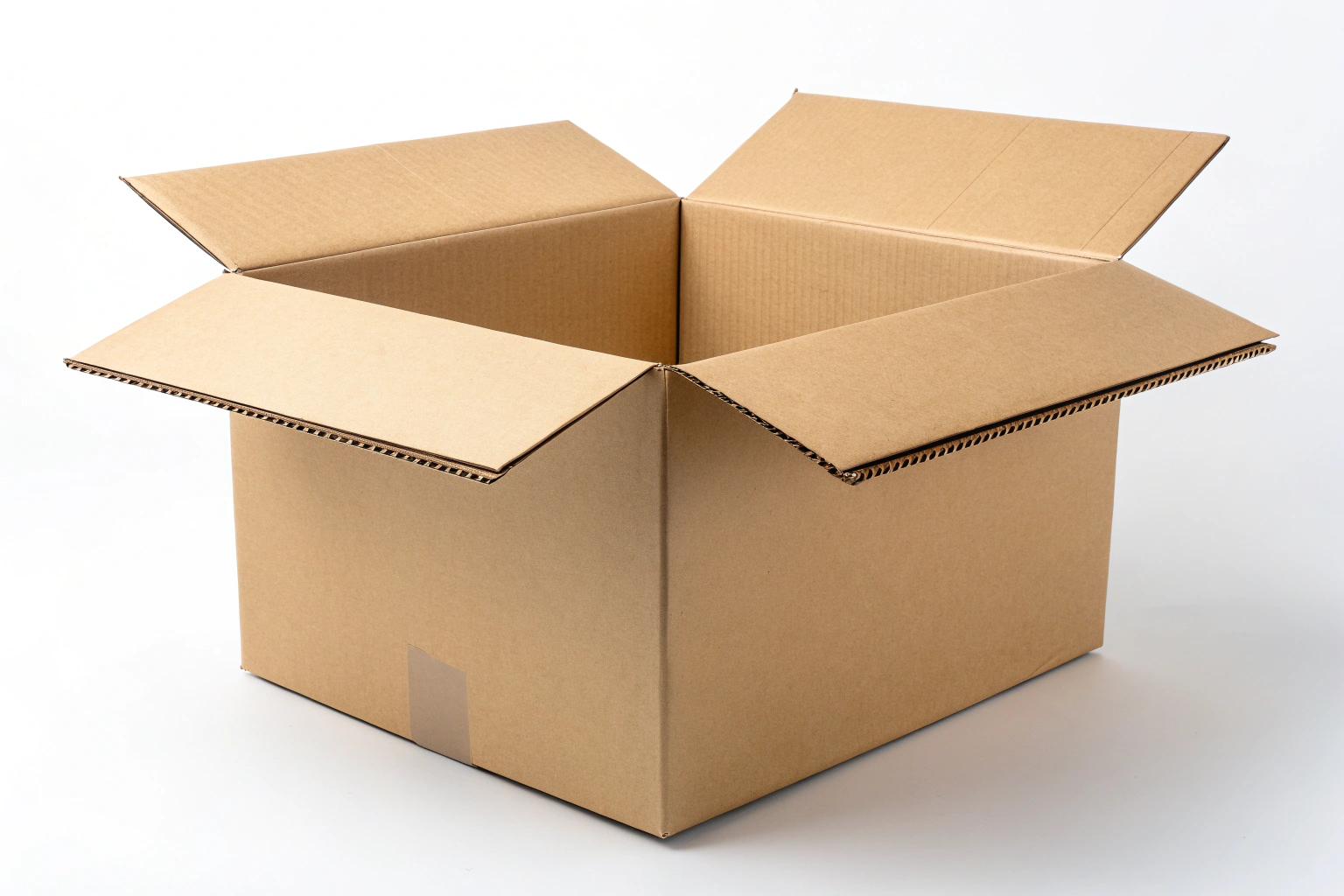
Kraft has a warm, natural, and understated appearance. Its brown surface works especially well for brands built around sustainability, handmade products, wellness, artisan food, or a more organic identity. The material itself becomes part of the design, so even simple printing can feel intentional and distinctive.
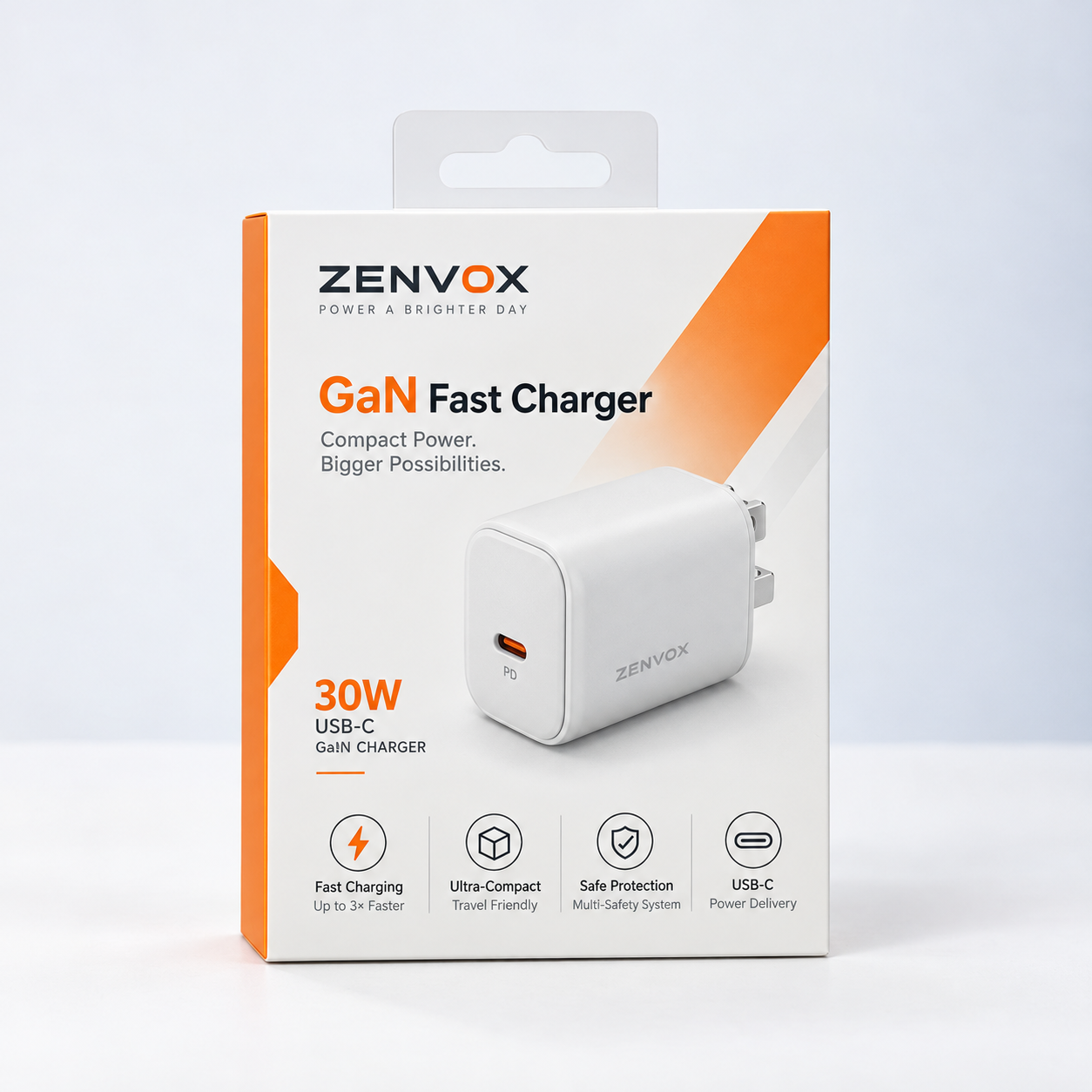
White mailer boxes create a cleaner and more controlled visual base. Because the surface is neutral, colors, photography, and detailed artwork are easier to reproduce accurately. This makes white packaging a strong choice for beauty, electronics, fashion, luxury products, and other categories where polished presentation matters.
Neither option is automatically better. The right choice depends on the personality you want the packaging to communicate. A botanical skincare brand may feel more natural in kraft, while a clinical or minimalist skincare line may look more consistent in white.
Print Quality and Color Performance
The biggest practical difference between kraft and white mailer boxes appears during printing.
Kraft’s natural brown tone affects every color printed on top of it. Bright shades often become warmer, darker, or more muted. A vivid coral may appear closer to terracotta, while a bright blue can take on a more subdued tone.
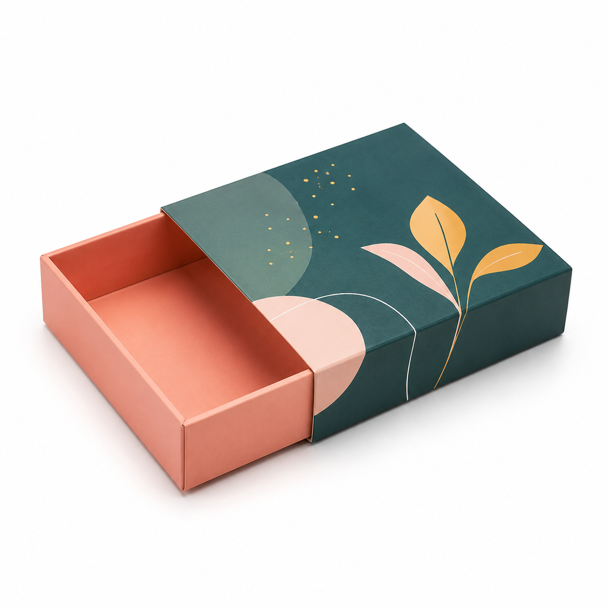
This effect can work beautifully with earthy color palettes, simple logos, line drawings, and one- or two-color designs. In these cases, the natural substrate adds character rather than limiting the artwork.
However, kraft is less suitable when exact color reproduction is important. Photography, detailed illustrations, gradients, and precise brand colors can be more difficult to reproduce consistently because the brown surface influences the final result.
White board provides a much more neutral printing surface. CMYK artwork usually appears brighter and closer to the original design, while gradients, small text, and fine details remain clearer. If your packaging depends heavily on photography or specific brand colors, white is generally easier to work with.
| Print requirement | Kraft mailer box | White mailer box |
|---|---|---|
| One- or two-color logo | works well and creates a natural look | clean and precise |
| Bright brand colors | may appear warmer or more muted | reproduces more accurately |
| Photography | color tones may shift | better for detailed image reproduction |
| Fine typography | possible, but contrast matters | generally sharper and easier to read |
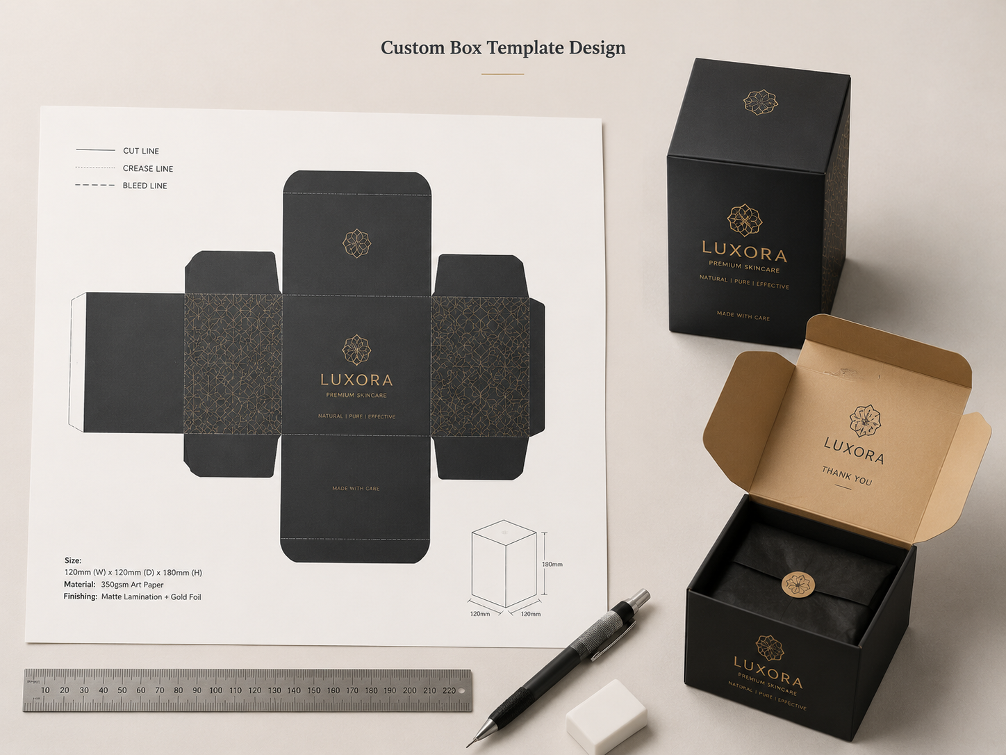
| Foil stamping | strong contrast and premium appearance | also works well |
| White design elements | may require white ink | white surface already provides the background |
One important detail is white artwork on kraft packaging. Because the substrate is brown, white graphics usually require a separate white ink layer or another printing process. This can increase production complexity, cost, and sometimes lead time.
For that reason, kraft works best when the artwork is designed around the natural material rather than trying to make it behave like a white printing surface.
Sustainability: Perception vs. Actual Performance
Kraft packaging is often seen as the more sustainable option because its natural brown surface looks less processed. That perception is understandable, but substrate color alone does not determine whether a mailer box is environmentally responsible.
Both kraft and white paper-based packaging can contain recycled fiber, use responsibly sourced paper, and be recyclable depending on the coatings, inks, adhesives, and additional components used. A white box is not automatically less sustainable, just as a kraft box is not automatically the greener choice.
If sustainability is an important part of your brand message, it is better to look at measurable factors such as recycled content, fiber sourcing, certification, material reduction, and end-of-life recyclability.
FSC-certified materials, for example, can provide stronger evidence that the fiber comes from responsibly managed and verified sources. This can apply to both kraft and white packaging.
Finishes also matter. Heavy plastic laminations, foam inserts, magnets, and difficult-to-separate components can complicate recycling regardless of the color of the board.
At PackBoxPrint, we recommend evaluating the complete packaging structure rather than choosing kraft based only on its natural appearance. If environmental claims are part of your branding, they should be supported by the actual material specification and production method.
Kraft vs. White Mailer Boxes: Which Costs More?
In many cases, the base price difference between kraft and white mailer boxes is smaller than brands expect. When the board weight, size, structure, and order quantity are similar, printing and finishing choices often have a greater impact on the final cost than substrate color.
A simple kraft mailer with a one-color logo may be economical because the artwork requires relatively little processing. A white box with full-color graphics, interior printing, foil stamping, embossing, or specialty coatings will naturally cost more.
However, that does not mean white packaging is always more expensive.
The same premium finishes can usually be applied to kraft packaging as well, and a heavily customized kraft box may cost more than a simple white one.
Some practical cost factors include:
- White ink on kraft: White graphics usually require an additional ink layer or print process.
- Inside printing: Printing both the exterior and interior normally adds another production step.
- Premium finishes: Foil stamping, embossing, debossing, spot UV, and specialty laminations increase cost on either substrate.
- Complex artwork: More demanding print requirements may require additional setup or more specialized production methods.
- Order quantity: Larger production runs generally spread setup costs across more units, reducing the cost per box.
- Box dimensions: Larger mailers use more material and can also increase storage and shipping expenses.
Instead of choosing kraft or white purely based on price, it is usually better to start with the brand look you want and then simplify the printing and finishing where necessary.
At PackBoxPrint, the most effective way to control cost is often to keep the structure efficient, choose finishes with a clear purpose, and order quantities that match realistic demand.
Final Thoughts
There is no single correct choice between kraft and white mailer boxes. Kraft works well for brands that want a natural, warm, and understated look, while white is usually better for packaging that depends on precise colors, detailed graphics, photography, or a cleaner premium presentation.
The best way to choose is to start with your brand identity, artwork, product type, and printing requirements. Cost and sustainability should also be considered, but in many cases the difference between kraft and white is smaller than the difference created by box size, print coverage, finishing, and order quantity.
At PackBoxPrint, custom mailer boxes can be developed in both kraft and white styles with a range of printing and finishing options. If you are unsure which material fits your brand best, comparing physical samples before production is one of the most practical ways to evaluate color, texture, print quality, and overall appearance before placing a larger order.